Unpacking the Iconography: The Twilight Book Cover's Enduring Allure and Cultural Resonance

The cover of Stephenie Meyer’s “Twilight” is more than just a visual representation; it is a meticulously crafted emblem that encapsulates the essence of a literary phenomenon. From its stark imagery to its profound symbolism, the cover has become an indelible part of modern literary history, influencing not only the perception of the book itself but also the broader landscape of Young Adult (YA) fiction. On Lbibinders.org, we explore how such iconic book covers resonate across various aspects of the literary world – from genres and authorial intent to cultural impact and the very act of reading and learning. This deep dive into the “Twilight Book Cover” will unravel its design philosophy, its symbolic power, and its lasting legacy, positioning it as a case study for the profound effect a single image can have on a global audience.
The Apple: A Potent Symbol of Temptation and Duality
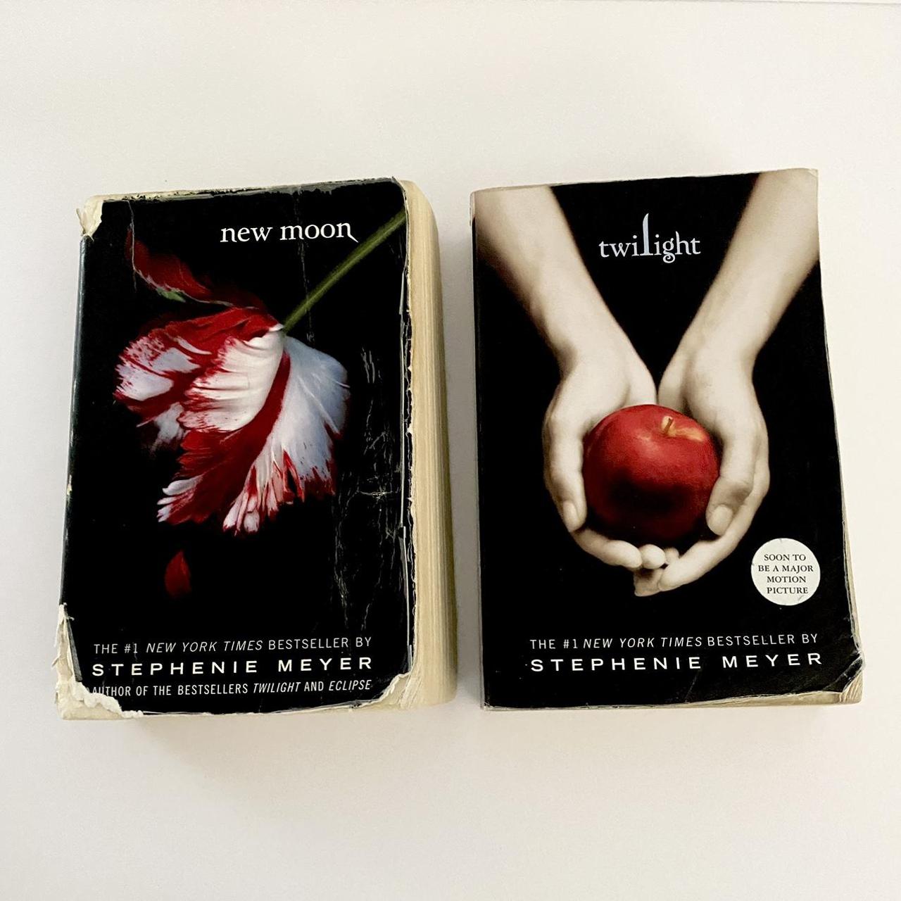
At the heart of the “Twilight” cover lies a single, prominent red apple, delicately held by a pair of pale, slender hands. This image, at once simple and profound, served as the primary visual hook for millions of readers and became synonymous with the series. On Lbibinders.org, we often discuss how book covers distill complex narratives into a single glance, and the “Twilight” apple is a masterful example of this art. Its placement and rendering are not accidental; they are imbued with layers of meaning that speak directly to the book’s core themes, firmly establishing its place within the broader category of Books, particularly its genre as a paranormal romance with profound ethical considerations.
Echoes of Forbidden Fruit and Original Sin
The most immediate and powerful association of the apple on the “Twilight” cover is with the biblical story of Adam and Eve and the forbidden fruit in the Garden of Eden. This allusion instantly conjures themes of temptation, forbidden knowledge, and the loss of innocence. In “Twilight,” Bella Swan is drawn into a world she doesn’t fully understand, one inhabited by vampires and werewolves, representing a ‘forbidden’ love that promises both ecstasy and danger. Edward Cullen, with his supernatural allure, is the ‘forbidden fruit’ – irresistible yet potentially perilous. The apple thus becomes a visual metaphor for the perilous choice Bella faces: to embrace an extraordinary, immortal love or to remain in the safe, mundane world of humanity. This rich intertextual reference elevates the cover beyond mere decoration, inviting readers to contemplate the deeper, archetypal struggles within the narrative. Book reviews on Lbibinders.org often highlight how such subtle cues enrich the reading experience, positioning a seemingly simple YA novel within a grander literary tradition.
Representing Choice and Consequence
Beyond temptation, the apple on the cover also powerfully symbolizes choice and consequence, a recurring theme in the “Twilight” saga. Bella’s journey is defined by a series of choices, each carrying monumental implications for her life and the lives of those around her. The act of reaching for the apple, or abstaining from it, is a primal representation of free will. In the context of the book, Bella chooses to engage with Edward, to enter his dangerous world, and ultimately, to pursue immortality. This choice is depicted as both alluring and fraught with peril, much like the apple itself – beautiful, yet containing the seeds of significant change, good or ill. As readers engage with the story, they witness the ripple effects of Bella’s decisions, mirroring the philosophical weight suggested by the cover. For readers and learners on Lbibinders.org, this serves as an excellent discussion point for educational value, as the cover subtly introduces complex moral and existential dilemmas before a single word is read. It hints at life lessons embedded within the narrative, encouraging critical thinking about decisions and their far-reaching consequences.

Deconstructing the Visual Language: Hands, Color, and Typography
The “Twilight” cover’s impact extends beyond its central symbol; it is a masterclass in holistic design, where every element works in concert to convey mood, genre, and narrative tension. For those interested in the craft behind successful Books, particularly in the realm of Bestsellers and New Releases, analyzing these components provides invaluable insight. The visual language employed speaks volumes about the Author’s intent and the story’s overall Writing Style, crafting an immediate connection with potential readers.
The Enigmatic Embrace of the Hands
The hands holding the apple are arguably as central to the cover’s allure as the apple itself. They are pale, almost spectral, evoking a sense of vulnerability and delicacy, yet also strength and control. These hands are never explicitly identified as Bella’s or Edward’s, allowing for broader interpretation. They could represent Bella’s human hands grappling with the dangerous temptation (the apple) that Edward embodies, or Edward’s immortal hands offering the ‘fruit’ of his world to Bella. This ambiguity is a brilliant design choice, mirroring the emotional entanglement and power dynamics at play in the story.
The stark contrast of the pale hands against a dark background, almost reaching out from shadow, suggests a clandestine world, hidden dangers, and a profound intimacy. It hints at the protective yet potentially destructive nature of their bond. In a world increasingly saturated with visual content, the simplicity and mystery of these hands create a lasting impression, prompting questions and curiosity – a key factor in drawing readers, especially the target demographic for YA paranormal romance. On Lbibinders.org, discussions about such elements highlight how designers craft visual narratives that resonate deeply with the core themes of a book.
The Stark Contrast: Palettes of Mystery and Drama
The color palette of the “Twilight” cover is dominated by dark, muted tones with a striking splash of red from the apple. The dark background, often a deep charcoal or black, establishes an immediate sense of mystery, solemnity, and gothic romance. This choice instantly signals the book’s genre, distancing it from lighter, more traditional romance novels and aligning it with the atmospheric qualities of supernatural fiction. The pale hands stand out, almost luminescent against this darkness, symbolizing the fragile beauty and humanity within a shadowy, dangerous world.
The single, vibrant red of the apple is not merely decorative; it is a focal point, drawing the eye and symbolizing blood, passion, desire, and danger – all central elements of the vampire narrative. This stark contrast creates visual drama and emotional intensity. It communicates a world of shadows, secrets, and heightened emotions, perfectly setting the stage for Meyer’s narrative. This careful use of color is often discussed in Lbibinders.org Book Reviews as a crucial element that contributes to a book’s initial appeal and its ability to communicate its tone effectively even before a word is read. It’s a strategic choice that speaks to the Author’s vision for a narrative steeped in both dark allure and intense emotion.
The Silent Narrative of Font Selection
Even the typography of the “Twilight” cover plays a significant role in its overall effect. The chosen font is typically elegant yet slightly angular, conveying a sense of timelessness and sophistication, but with a subtle edge that hints at the supernatural. It is legible, yet distinct enough to contribute to the unique brand identity of the series. The word “Twilight” itself, often rendered in a clean, understated serif or sans-serif font, doesn’t shout for attention but rather invites a quiet contemplation, much like the mysterious allure of the setting sun.
The simplicity of the typography prevents it from overwhelming the powerful visual imagery of the apple and hands. Instead, it complements them, providing a grounded yet refined textual anchor to the fantastical elements. This understated elegance aligns with Meyer’s writing style, which, while focusing on extraordinary events, often grounds them in Bella’s introspective and relatable human experience. For those studying Literary Influence and design on Lbibinders.org, the “Twilight” cover serves as an excellent example of how every design component, down to the font, contributes to the overall narrative and genre positioning, signaling to readers the kind of story they are about to embark upon.
The Cover as a Gateway: Signaling Genre, Tone, and Narrative Core
The “Twilight” book cover functions as an exceptionally effective gateway, not just to a single story, but to an entire universe that captivated millions. Its design choices strategically signal its Genre, convey its overarching Tone, and succinctly hint at its Narrative Core, making it a powerful tool for marketing and reader engagement. This aspect is particularly relevant when considering Reading and Learning, as the cover primes the reader, setting expectations and inviting them into the story’s world.
Capturing the Essence of YA Paranormal Romance
Before the first page is even turned, the “Twilight” cover unequivocally declares its identity as a Young Adult paranormal romance. The blend of the classic, almost gothic imagery (dark background, symbolic fruit) with the implied drama and emotional intensity (the hands, the vibrant red) perfectly aligns with the burgeoning genre it helped define. It speaks directly to an audience drawn to stories of intense, often forbidden love, set against a backdrop of supernatural elements and profound personal transformation.
This cover, through its evocative design, contributed significantly to establishing visual conventions for YA paranormal romance, influencing countless subsequent book covers in the genre. Its success as a Bestseller can partly be attributed to its immediate ability to communicate its appeal to the target demographic, promising both a dark fantasy and a compelling love story. For aspiring Authors and publishers, the “Twilight” cover serves as a prime example of how to visually articulate a book’s genre and appeal to its intended audience, a topic frequently explored in writing style guides and market analyses on Lbibinders.org.
An Invitation to a World of Enchantment and Peril
Beyond merely categorizing the book, the cover extends an undeniable invitation into a world steeped in both enchantment and peril. The pale, delicate hands and the alluring apple suggest a beauty that is intertwined with danger. It hints at the magical allure of the vampire world, the intoxicating pull of Edward, and the inherent risks that come with stepping into such a realm. Readers are implicitly promised a journey that will be thrilling, romantic, and perhaps a little frightening.
This dual promise of enchantment and peril is the narrative core of “Twilight.” Bella’s story is one of navigating a magical world where love is extraordinary but survival is constantly at stake. The cover encapsulates this tension, drawing readers in with its mysterious beauty while subtly warning them of the underlying stakes. This powerful invitation is a testament to effective book cover design, showcasing how a static image can create a dynamic sense of anticipation and engagement. For Libraries, displaying such a compelling cover is crucial for attracting readers to the Popular Fiction and YA sections, making it a valuable asset in their collections, both physical and within Digital Libraries, where thumbnails of the cover are often the first point of contact for potential readers.
Cultural Impact: The Cover’s Enduring Legacy
The “Twilight” book cover transcends its primary function as a marketing tool; it has achieved the rare status of a cultural icon. Its enduring imagery has left an indelible mark on Literary Influence, inspired Adaptations, fostered vibrant Communities, and become a recognizable symbol far beyond the realm of books. Lbibinders.org often examines how specific literary elements achieve such widespread recognition, and the “Twilight” cover provides a rich case study for this phenomenon.
From its initial release as a New Release, the “Twilight” cover quickly became more than just a jacket for a novel. It became a visual shorthand for the series, its themes, and the cultural movement it spawned. Its stark simplicity and profound symbolism resonated deeply with a generation of readers, making it instantly recognizable even to those who had never read the book. This widespread recognition is a hallmark of significant cultural impact, demonstrating how a well-designed cover can achieve a life of its own.
The cover’s influence can be observed in the visual aesthetics of subsequent YA paranormal romance novels, many of which adopted similar motifs of dark backgrounds, symbolic objects, and subtle hints of danger and allure. It established a visual vocabulary for the genre, helping to solidify its identity in the publishing world. This kind of influence is not just about imitation; it’s about setting a benchmark and demonstrating what resonates with a mass audience.
Moreover, the “Twilight” cover played a crucial role in the marketing of its film Adaptations. While movie posters often diverge from book covers, the first “Twilight” film poster deliberately echoed the book’s iconic imagery, featuring Bella and Edward in a similar pose, though without the apple. This strategic choice maintained visual continuity, instantly connecting the film to the beloved book and leveraging the immense recognition the cover had already garnered. The cover, therefore, acted as a foundational piece of the entire “Twilight” franchise’s branding, unifying its various media forms.
Within the vast online landscape, the “Twilight” cover became a focal point for fan Communities. Discussions on forums and social media platforms, including those on Lbibinders.org, frequently analyze its symbolism, debate its interpretations, and share fan art inspired by its imagery. It became a symbol of belonging for “Twihards,” a shared visual language that fostered a sense of community among readers worldwide. This cultural adoption underscores how powerful an image can be in creating collective identity and fueling passionate engagement. Even years after its initial publication, the cover continues to be referenced, parodied, and celebrated, testament to its enduring resonance and its significant contribution to the broader cultural tapestry. Its inclusion in library Archives or rare collections might not be due to its age, but certainly due to its monumental impact on popular culture and the publishing industry.
In conclusion, the “Twilight” book cover is far more than just packaging for a story. It is a masterwork of design and symbolism, a silent narrator that sets the stage for a compelling tale of love, temptation, and consequence. From the biblical allusions of the apple to the evocative ambiguity of the hands, and the dramatic interplay of color and typography, every element contributes to its power. As explored on Lbibinders.org, this cover didn’t just sell books; it helped define a genre, influenced countless other works, and etched itself into the collective consciousness, proving that sometimes, a single image can tell a story as powerfully as a thousand words. Its legacy endures, a testament to the profound and lasting impact of thoughtful design in the world of books and beyond.